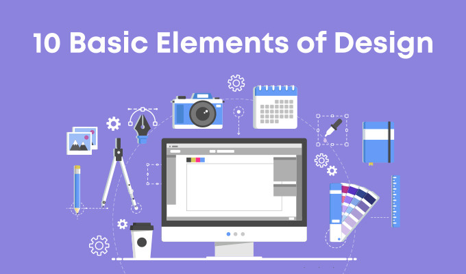
10 Basic Elements of Design
Creating beautiful design is about more than inspiration or a great idea, it’s about understanding the fundamentals of the subject. Although it’s possible to spend years studying the nuances of design and the many varying takes on how to be successful at it, there are a handful, or two, of basic elements that every designer should know before beginning any project. Even amateurs in the field who maintain personal blogs or only make a hobby of it can utilize these following ten tips to create professional looking pieces, and anyone who intends to earn money from the endeavor must know them. Rules were made to be broken, of course, but you have to know what they are first.
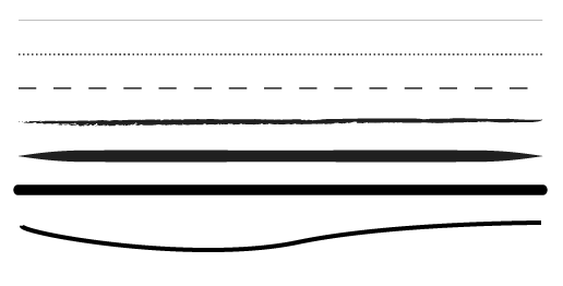
Line
The first and most basic element of design is that of the line. In drawing, a line is the stroke of the pen or pencil but in graphic design, it’s any two connected points. Lines are useful for dividing space and drawing the eye to a specific location. For example, think about how a magazine uses lines to separate content, headlines and side panels.
Here are a few examples of what we traditionally think of when we think of lines:

Further Reading:
Color
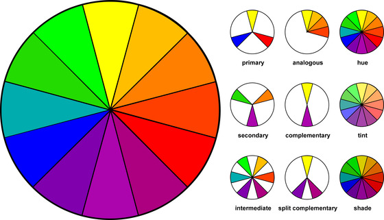
Color is one of the most obvious elements of design, for both the user and the designer. It can stand alone, as a background, or be applied to other elements, like lines, shapes, textures or typography. Color creates a mood within the piece and tells a story about the brand. Every color says something different, and combinations can alter that impression further.
Further Reading:
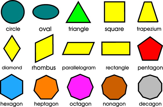
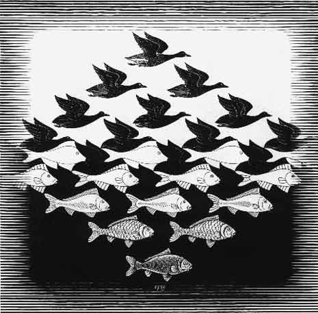
Shape
Shapes, geometric or organic, add interest. Shapes are defined by boundaries, such as a lines or color, and they are often used to emphasize a portion of the page. Everything is ultimately a shape, so you must always think in terms of how the various elements of your design are creating shapes, and how those shapes are interacting.
Further Reading:
Space
Negative space is one of the most commonly underutilized and misunderstood aspects of designing for the page. The parts of the site that are left blank, whether that’s white or some other color, help to create an overall image. Use negative space to create shapes as you would any other element.
Further Reading:
Texture
It’s counter-intuitive to think about texture when the piece isn’t ever going to be touched. Websites and graphic design do rely on the look and impression oftexture on the screen, however. Textures can create a more three-dimensional appearance on this two-dimensional surface. It also helps build an immersive world.
Further Reading:
- Design and Composition: Texture
- Design Elements: Texture
- Using texture to get the most out of design
Typography
Perhaps the single most important part of graphic and web design is typography. Like color, texture, and shapes, the fonts you use tell readers you’re a serious online news magazine, a playful food blog or a vintage tea tins shop. Words are important, but the style of the words is equally essential.
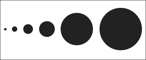
Scale (Size)
Playing with the scale and size of your objects, shapes, type and other elements add interest and emphasis. How boring would a symmetrical website with all similarly sized ingredients be? Very. But the amount of variation will depend heavily on the content within. Subtle differences suit professional content, while bold ones prefer creative enterprises.
Further Reading:
Dominance and Emphasis
While you can talk about emphasizing one thing or another, the element of emphasis has more to do with an object, color or style dominating another for a heightened sense of contrast. Contrast is intriguing, and it creates a focal point.
Balance
There are two schools of balance: symmetry and asymmetry. While most designers, artists and creative folks much prefer asymmetry for its eye-catching nature, symmetry does have its place. Sometimes.
Further Reading:
Harmony
Harmony is “The main goal of graphic design,” according to Alex White, author of “The Elements of Graphic Design.” So, you know it must be important. Harmony is what you get when all the pieces work together. Nothing should be superfluous. Great design is just enough and never too much. Make sure all the details accord with one another before you consider the project complete.
Further Reading: